A pharmacy,
refreshed.
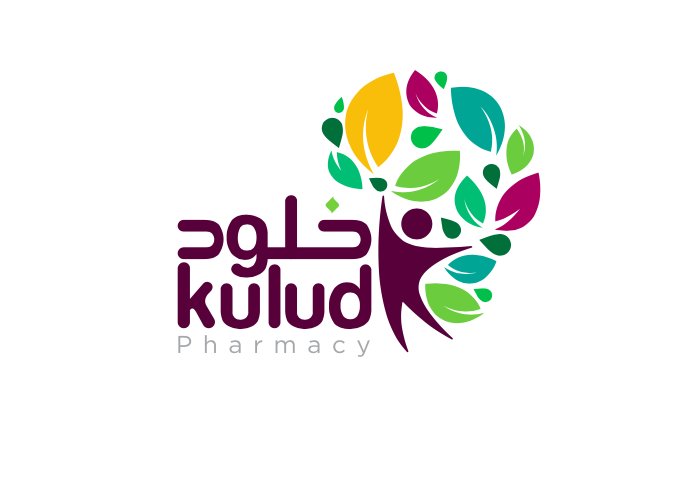
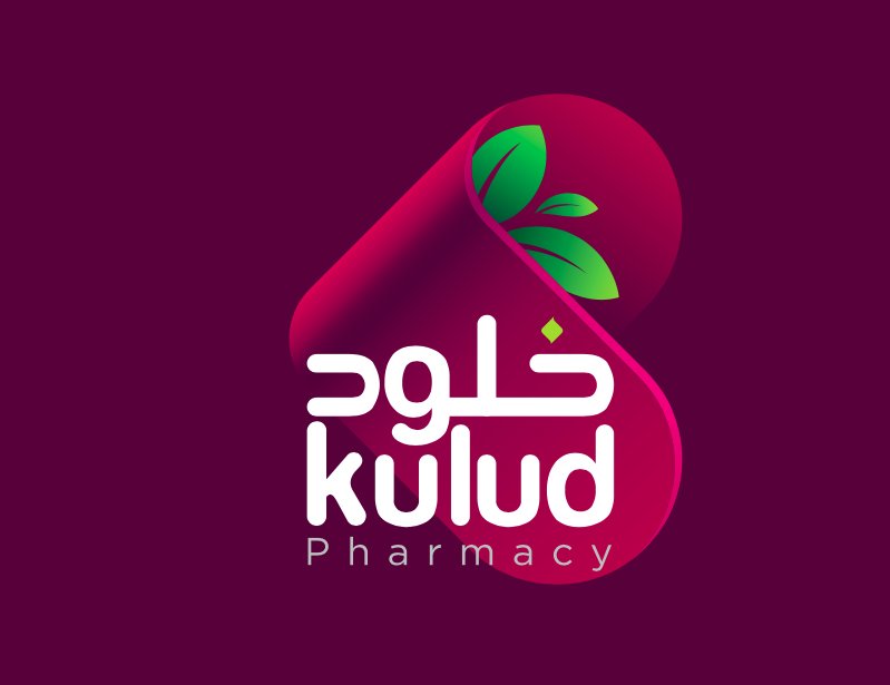
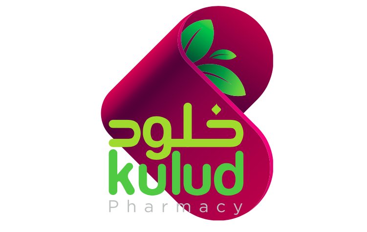
A brand refresh for Kulud, Qatar's home-grown pharmacy chain — keeping what customers already recognised, modernising everything else, rolling it across storefronts, packs, and digital.
The brief
Kulud had strong local recognition but a visual system that hadn't aged with its audience. The brief was a refresh, not a rebrand — throw nothing away that customers already trusted.
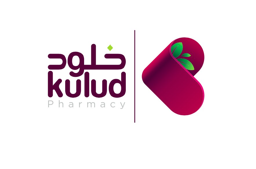
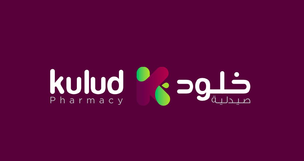
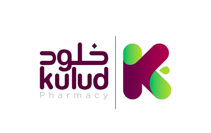
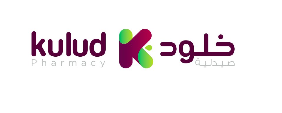
We kept the wordmark spirit, modernised the colour system, introduced a bilingual typographic pair that holds up from a one-cm sticker to a six-metre facade, and rolled the system across in-store signage, own-label packaging, and the Kulud digital presence.
How we worked
01 — Audit first
Shopped five branches before sketching.
02 — Keep the equity
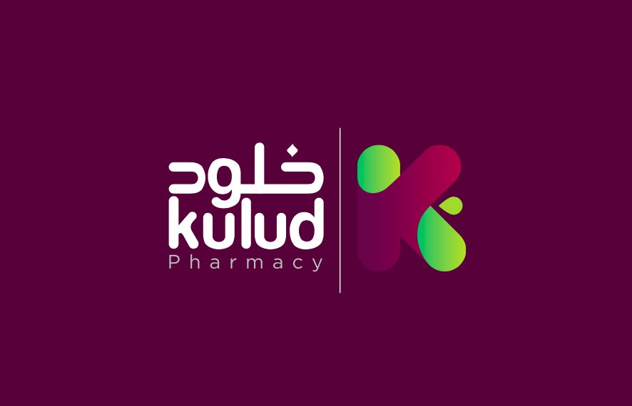
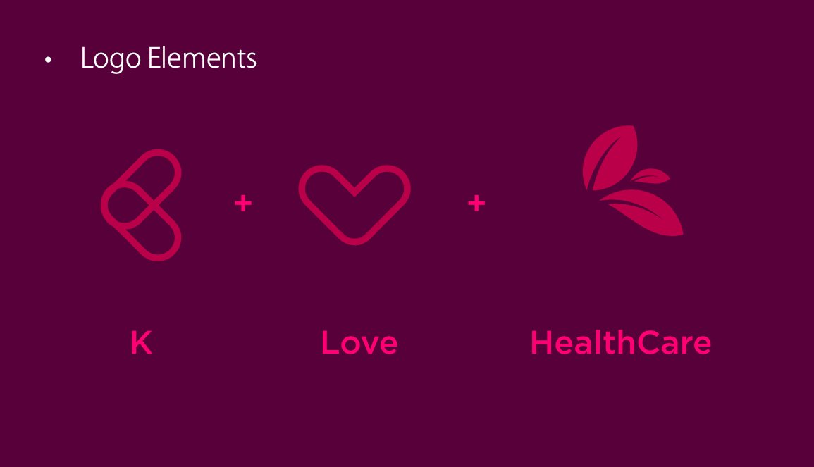
Wordmark stays. Colour system gets refined. Iconography rebuilt from scratch.
03 — Bilingual pair
Latin + Arabic pair chosen for retail scale — readable from across an aisle.
04 — Roll in stages
Signage first, pack next, digital last. No chaos visit.
A pharmacy, refreshed.
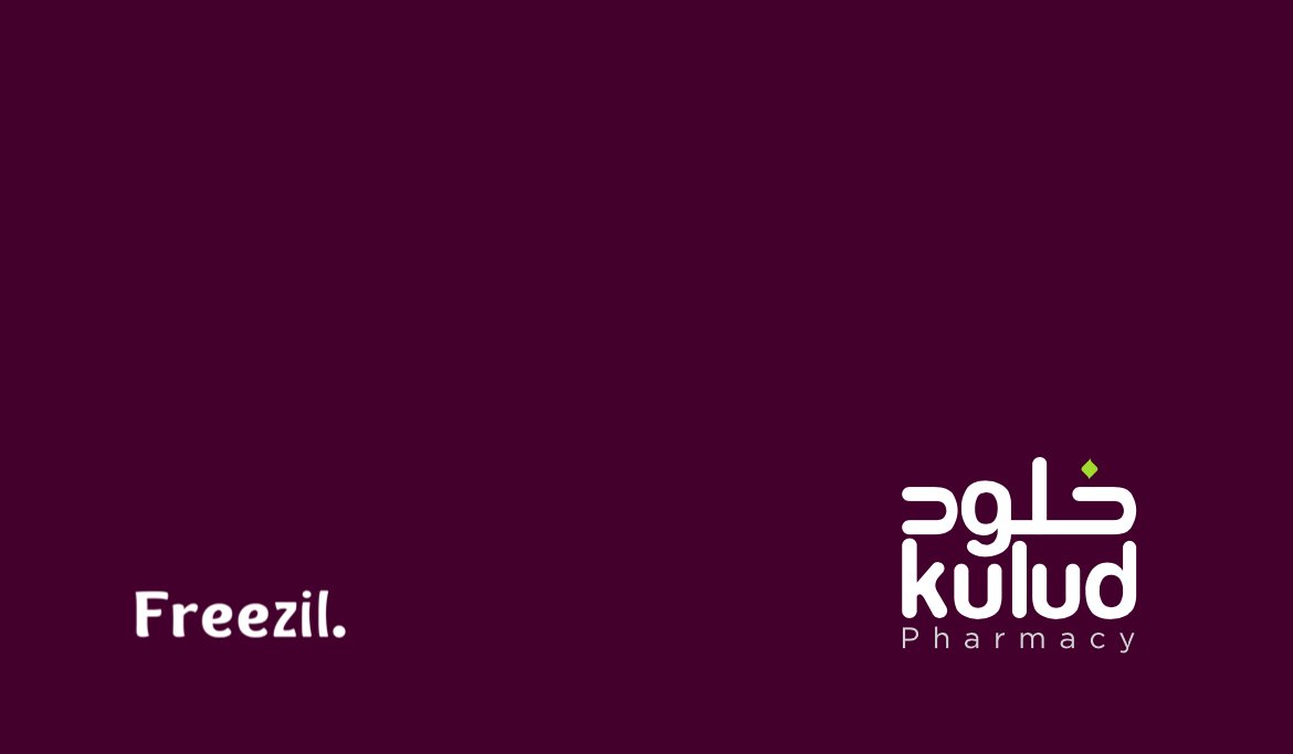
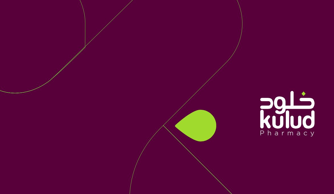
Pages from the Kulud rebrand — logo, palette, packaging, environment.

Read the next case →
Refreshing without starting over?
Tell us what you love about the current brand. We'll modernise the rest.
More work from the studio.
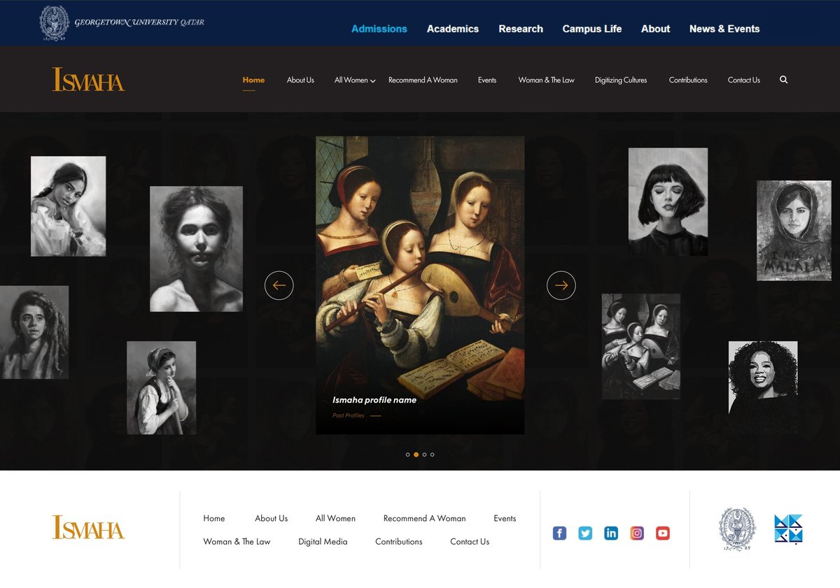
ISMAHA, shipped — Georgetown University Qatar
A Next.js platform for ISMAHA — Georgetown's programme for women-led entrepreneurship in the region.
Bilingual, and shipping — QPlastics
For QPlastics we designed a full brand identity and shipped their new bilingual corporate website together
Eight research findings — WISE · Qatar Foundation
Our first collaboration with WISE — an editorial system for the 2019 Research Findings Report. Academic rigour, modern design vocabulary, bi