Islamic art, modern grammar.
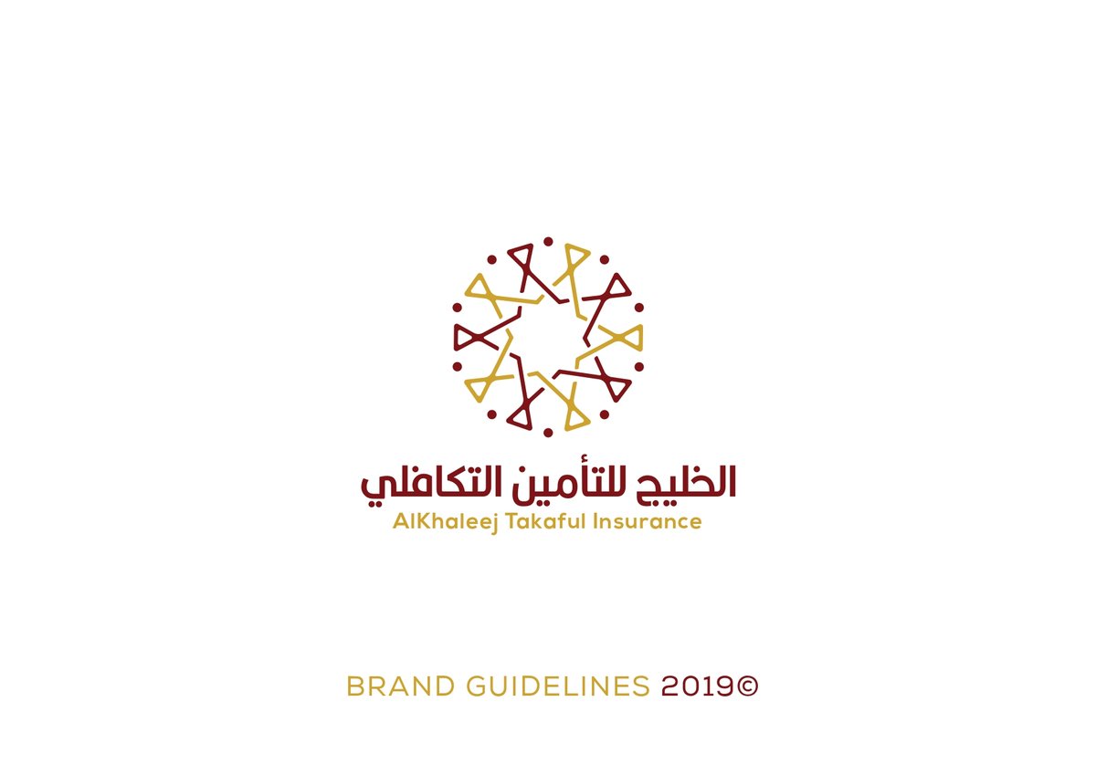
A full rebrand for one of Qatar's oldest takaful firms — a visual system built on the geometry of the eight-point star, made to sit as naturally on a mobile app home screen as it does on a branch window in Souq Waqif.
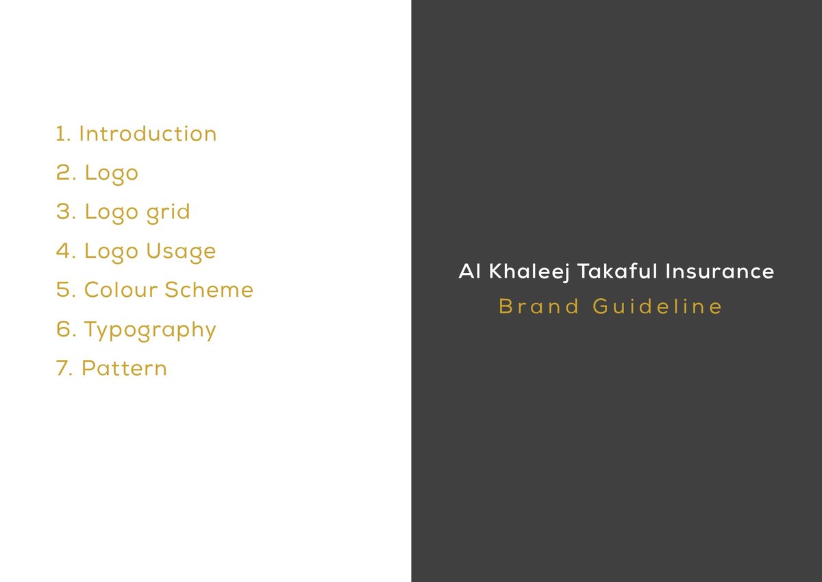
System & applications
Takaful
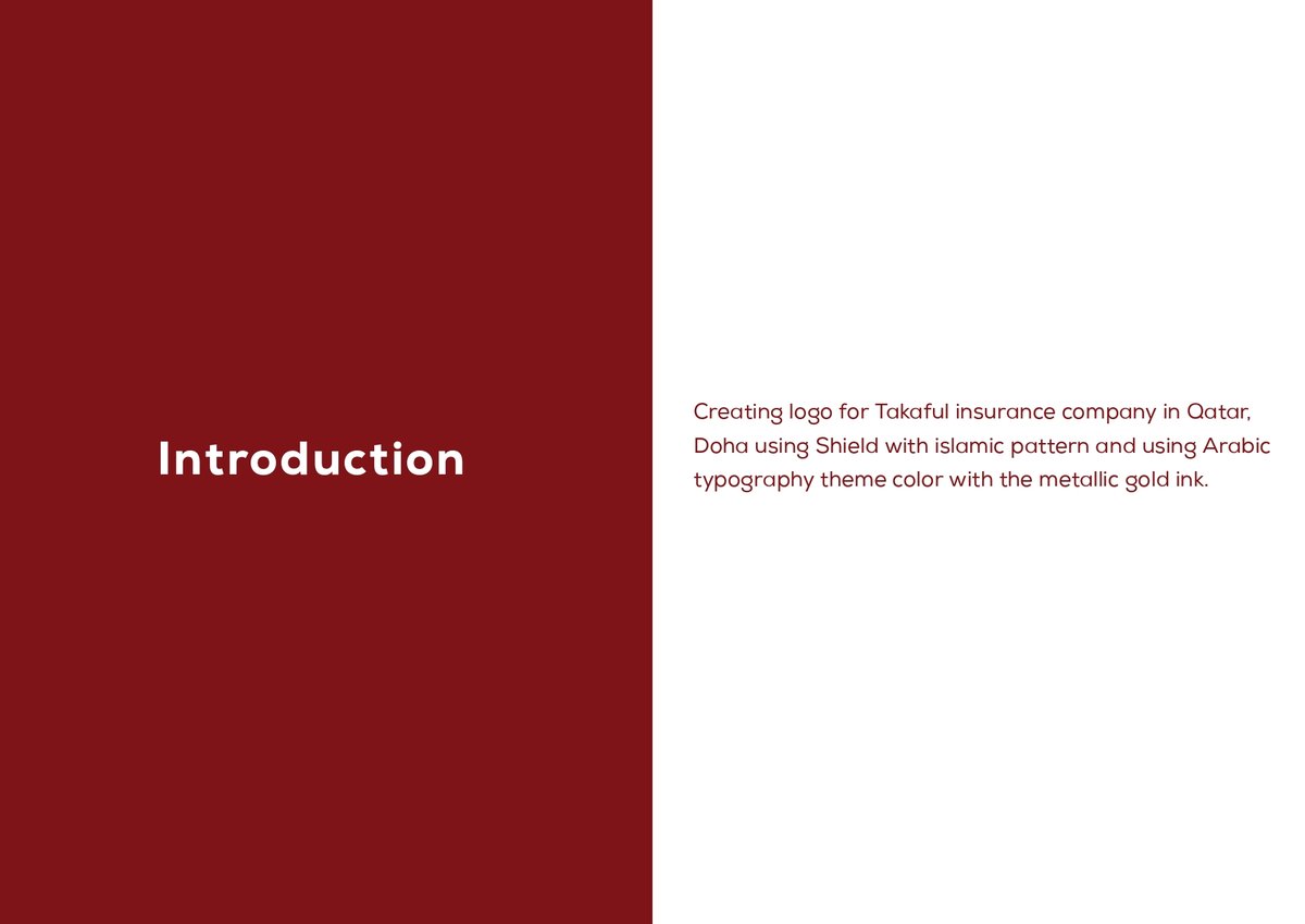
The brief
A forty-year-old insurance firm with roots in Qatar's Islamic finance tradition, staring down a generation of customers who pay premiums from a phone. The mark needed to feel trusted by the grandfather and clean enough for the grandchild — neither "heritage gift shop" nor "fintech that forgot where it's from".
The constraint: every existing customer would still recognise it as theirs. A rebrand, not a reboot.
How we worked
01 — A visit to the source
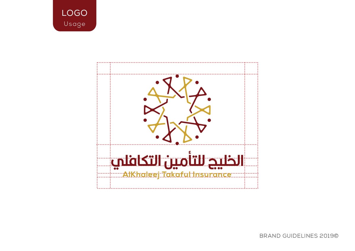
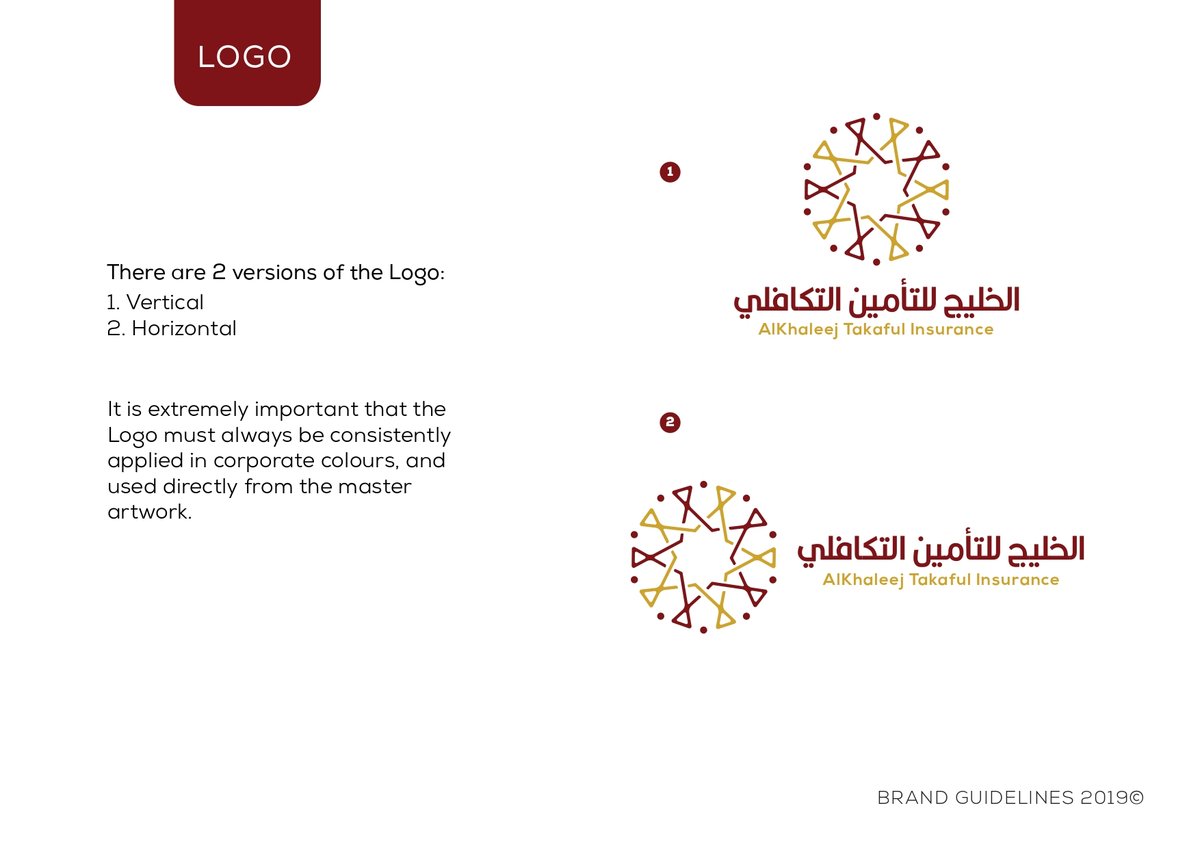
We started in Souq Waqif and the Museum of Islamic Art. The eight-point star — khatam — isn't decoration in this tradition; it's a mathematical statement about protection and wholeness. Takaful, mutual protection, meant the mark could carry the concept honestly.
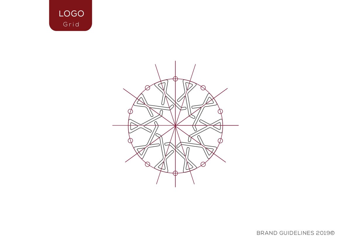
02 — Geometry as a system
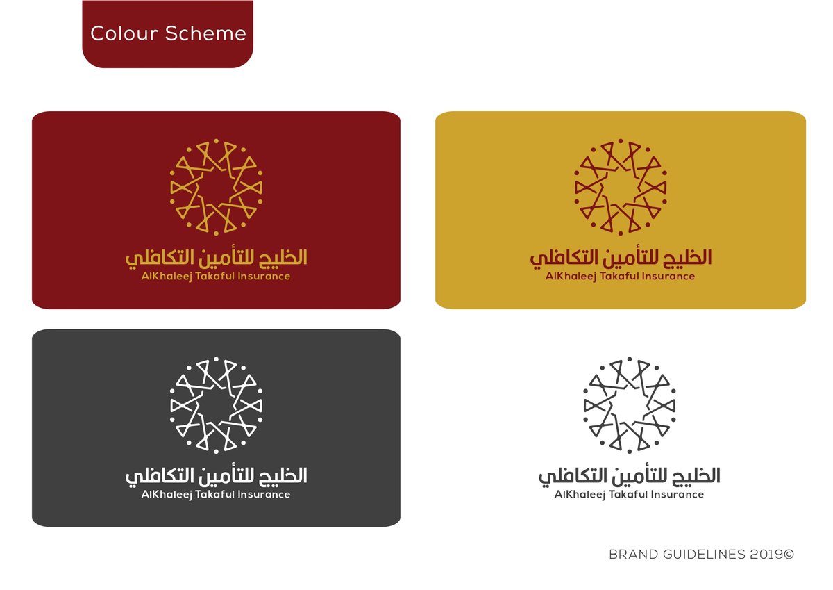
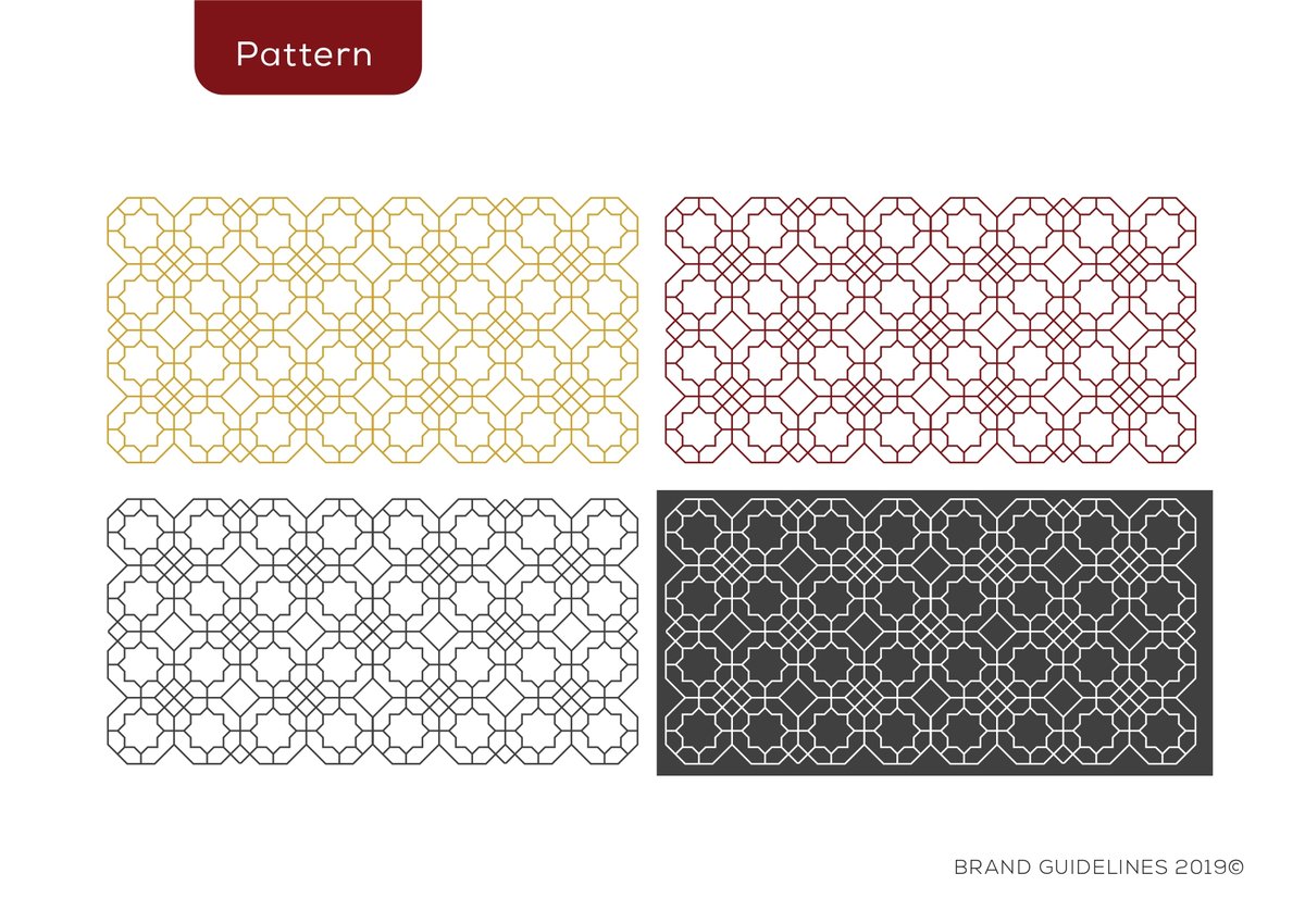
Not one logo — a grammar. The star was built from a repeatable unit that could compress into a favicon, expand into a branch facade, and pattern across a policy document without losing its centre.
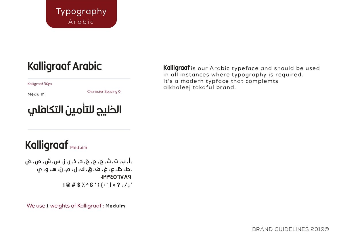
03 — Typography with two native languages
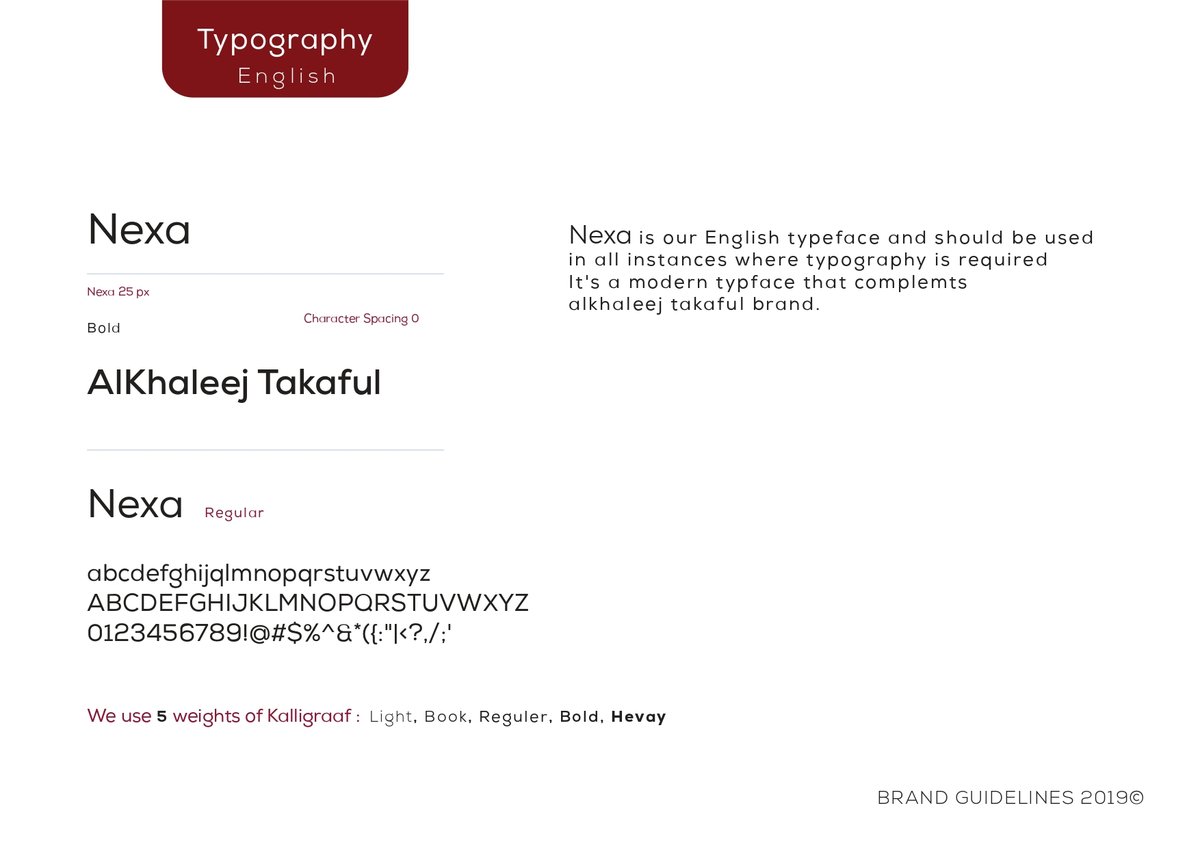
A custom Arabic wordmark drawn in dialogue with the Latin — same stroke axis, same counter rhythm. Neither was asked to mimic the other; both were asked to belong together.
04 — Rolled out, not just delivered
Stationery, app UI, branch signage, vehicle livery, policy documents, social templates. Sixty-plus pages of guidelines, plus a half-day workshop with the internal marketing team so the system could live past the agency handover.
Islamic art, modern grammar.
Pages from the Al Khaleej Takaful rebrand — Islamic art, modern grammar.


Ooredoo —
Four characters, one universe.
Thinking about a rebrand?
Tell us the heritage, the audience, and the constraint. A discovery outline and a quote back within a business day.
More work from the studio.
A regulator, made clear — CRA Qatar
A service-campaign animation for the Communications Regulatory Authority of Qatar — translating the scope of CRA's work into examples citize
Bilingual, and shipping — QPlastics
For QPlastics we designed a full brand identity and shipped their new bilingual corporate website together
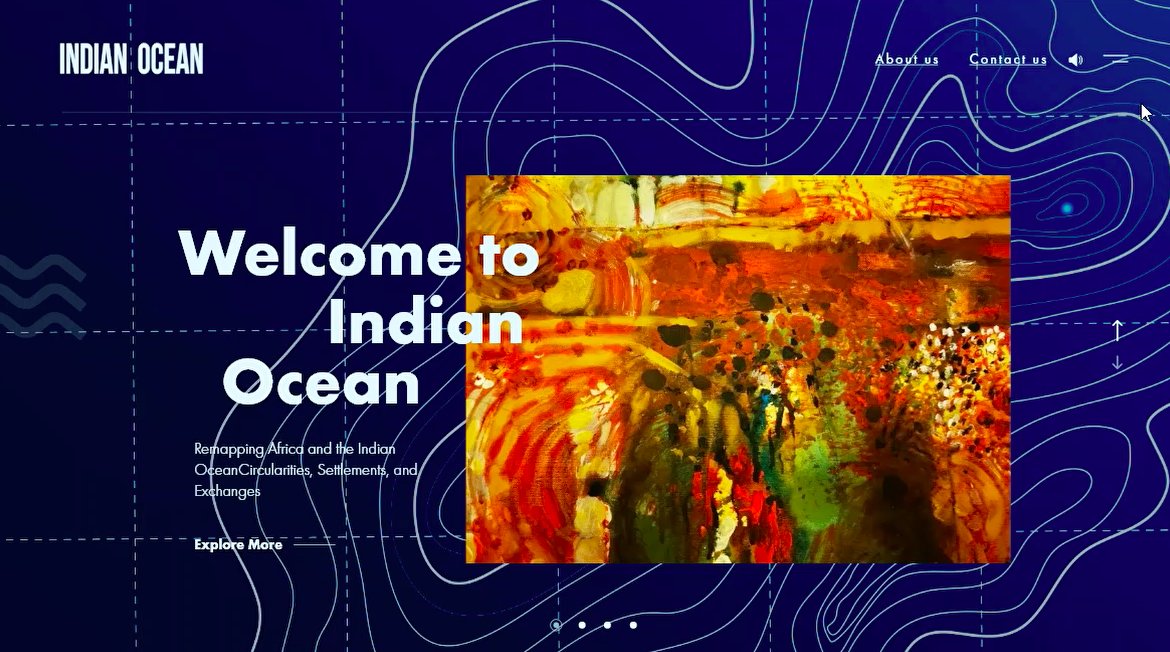
Mapping an ocean — Georgetown University Qatar
A research microsite for Georgetown University Qatar's Indian Ocean project — a scroll-driven public-facing site with an interactive map